Chapter 2 Plotting
The function ggplot_dt takes a data table containing data and will plot the data as a map. The data table needs to contain columns named lon and lat,
and the gridpoints should be regularly spaced (e.g. half-degrees):
data("chirps_monthly")
ggplot_dt(chirps_monthly)
## Warning in modify_dt_map_plotting(dt = dt, data_col = data_col): The data table contains multiple levels per lon/lat. The following selection is plotted:
## month = 11
## year = 1991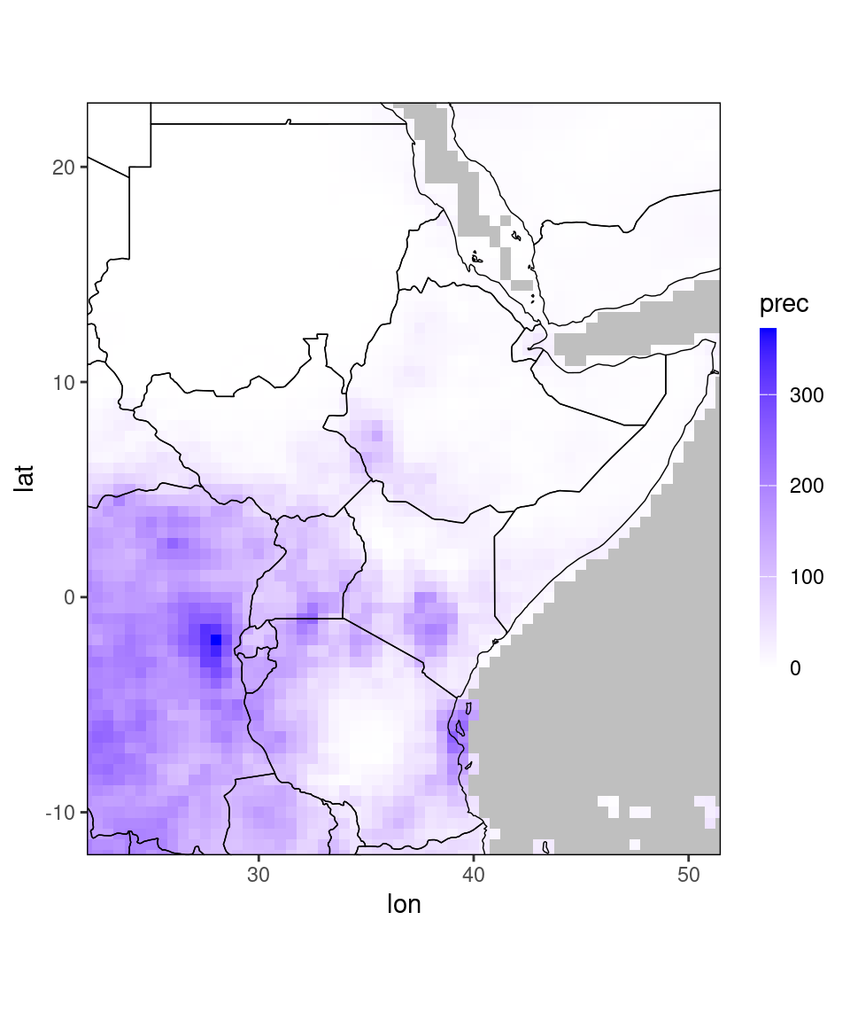
The function returns a warning that the data contains multiple levels per coordinate. The reason is that chirps_monthly contains precipitation-observations for many years and two months, so the plotting function has to select a month and year for plotting. By default, it selects the coordinates that first appear in the data table. Additionally, it prints out a warning telling you which subselection it shows. If we want to plot a different year and month, we can use the data.table subsetting syntax (see last chapter):
ggplot_dt(chirps_monthly[year == 2020 & month == 11])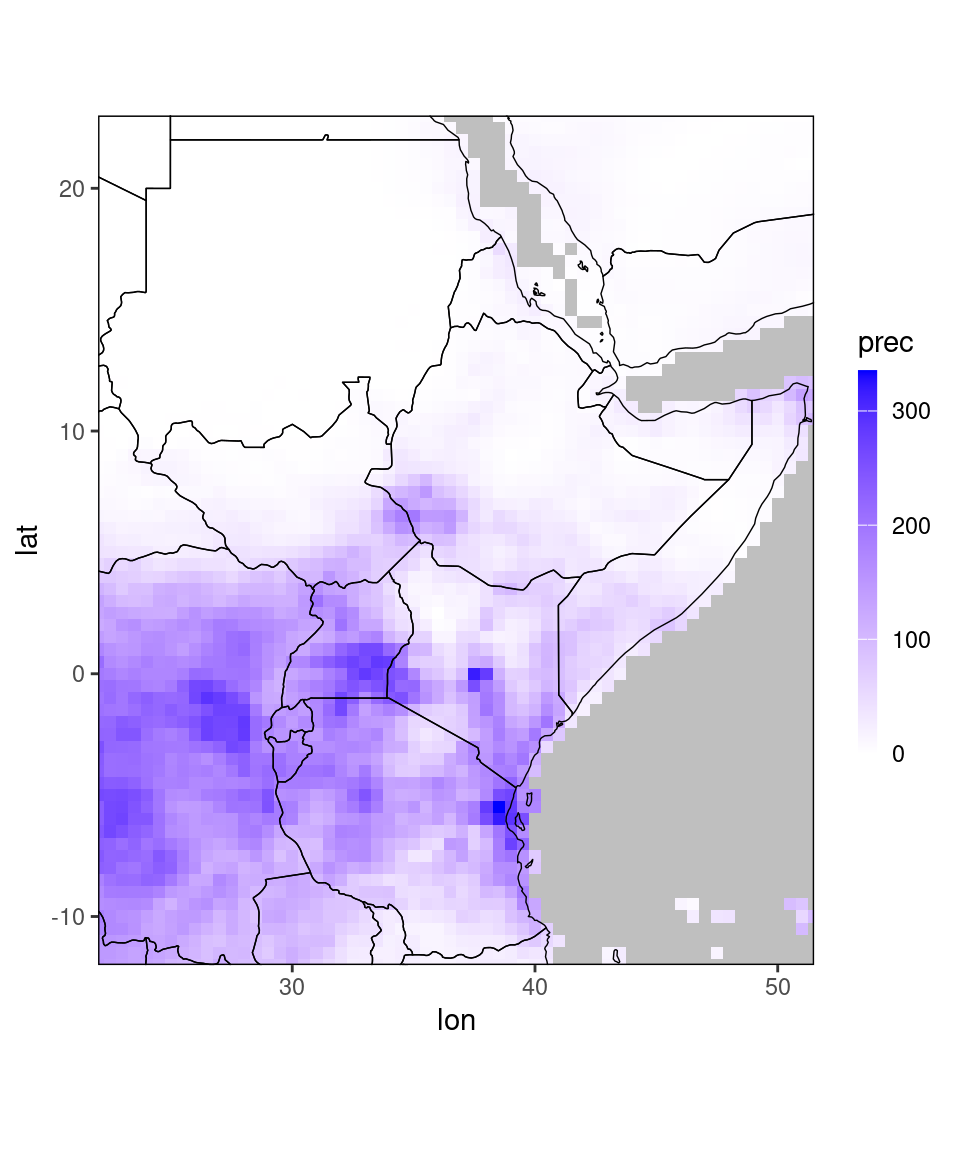
Let us look at the data for plotting:
print(chirps_monthly)## Index: <month__year>
## lon lat prec month year terc_cat
## <num> <num> <num> <int> <int> <int>
## 1: 22.0 -12.0 199.68 11 1991 1
## 2: 22.0 -11.5 198.87 11 1991 1
## 3: 22.0 -11.0 157.86 11 1991 0
## 4: 22.0 -10.5 144.15 11 1991 -1
## 5: 22.0 -10.0 153.96 11 1991 -1
## ---
## 209036: 51.5 21.0 7.20 12 2020 -1
## 209037: 51.5 21.5 6.54 12 2020 -1
## 209038: 51.5 22.0 6.15 12 2020 -1
## 209039: 51.5 22.5 4.86 12 2020 -1
## 209040: 51.5 23.0 4.17 12 2020 -1This data has four dimension variables (lon, lat, year, month), and two value variables (prec and terc_cat). By default, ggplot_dt plots the first column that contains a value variable. You can see which columns are considered dimension variables by runing dimvars(chirps_monthly). A full list of column names considered dimension variables is returned if you just type dimvars(). Everything that is not considered dimension variable is considered value variable.
If we want to change the column that is plotted we can specify the name of the plotting column as second argument:
ggplot_dt(chirps_monthly,'terc_cat')## Warning in modify_dt_map_plotting(dt = dt, data_col = data_col): The data table contains multiple levels per lon/lat. The following selection is plotted:
## month = 11
## year = 1991## Check out the function tercile_cat() for plotting tercile-categories.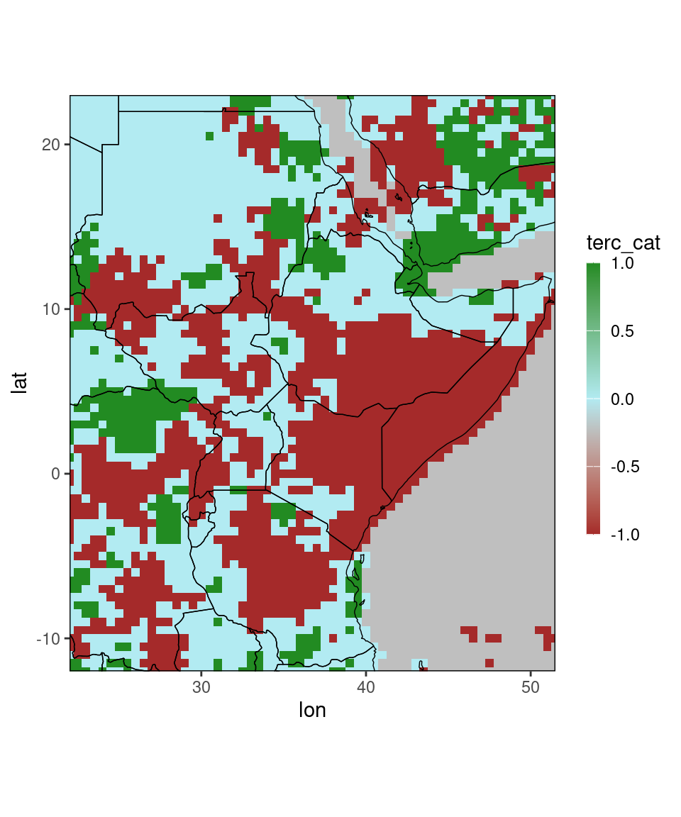 Note that the function selects different default-colors for the
 terc_cat-column.
Of course you can also control the color scales manually, more on this later.
Certain column names are recognized by the package, e.g. all names listed in tc_cols() are recognized as column names for tercile categories.
For these, the color scale of the plot is adjusted to match the color of verification maps. Moreover, the function kindly points out that there is a separate function for tercile categories,
namely tercile_plot(), which we will discuss in Plots for the Greater Horn of Africa.
The plotting window is automatically adjusted to the data. If you have data covering the entire earth, the entire earth will be plotted. If you want to focus the plot to a specific region, you can do this by subsetting the data table:
# a region containing Tanzania
ggplot_dt(chirps_monthly[lon %between% c(28,43) & lat %between% c(-12,1)])
## Warning in modify_dt_map_plotting(dt = dt, data_col = data_col): The data table contains multiple levels per lon/lat. The following selection is plotted:
## month = 11
## year = 1991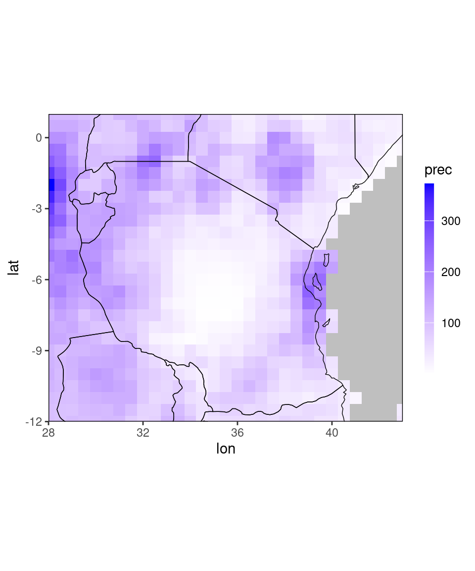
The function has further optional arguments (also recall that you can access the function documentation summarizing all of this by typing ?ggplot_dt):
ggplot_dt(chirps_monthly,
          mn = 'November 2021 precipitation', # add a title to the plot
          rr = c(0,100), # fix the limits of the color scale
          name = 'mm') # change the legend label
## Warning in modify_dt_map_plotting(dt = dt, data_col = data_col): The data table contains multiple levels per lon/lat. The following selection is plotted:
## month = 11
## year = 1991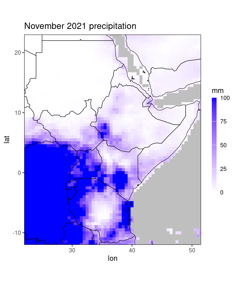
In this example we set the lower limit of the color scale to 0 and the upper limit to 100. By default the data is truncated at the ends of the color scale, so every pixel with precipitation of above 100 mm is now shown in the same dark blue. Setting the range of the color scale is useful for making several plots comparable or to force symmetry around 0, e.g. when plotting correlations or anomalies:
dt = copy(chirps_monthly) # this is necessary before modifying the example data.
dt[,clim := mean(prec), by = .(lon,lat,month)] # add a climatology column to dt
dt[,ano := prec - clim] # add an anomaly column to dt
print(dt)
## Index: <month__year>
## lon lat prec month year terc_cat clim ano
## <num> <num> <num> <int> <int> <int> <num> <num>
## 1: 22.0 -12.0 199.68 11 1991 1 157.920 41.760
## 2: 22.0 -11.5 198.87 11 1991 1 162.781 36.089
## 3: 22.0 -11.0 157.86 11 1991 0 165.031 -7.171
## 4: 22.0 -10.5 144.15 11 1991 -1 169.285 -25.135
## 5: 22.0 -10.0 153.96 11 1991 -1 183.343 -29.383
## ---
## 209036: 51.5 21.0 7.20 12 2020 -1 7.636 -0.436
## 209037: 51.5 21.5 6.54 12 2020 -1 7.258 -0.718
## 209038: 51.5 22.0 6.15 12 2020 -1 6.459 -0.309
## 209039: 51.5 22.5 4.86 12 2020 -1 5.503 -0.643
## 209040: 51.5 23.0 4.17 12 2020 -1 4.890 -0.720ggplot_dt(dt[month == 11 & year == 2020], 'ano', rr = c(-90,90))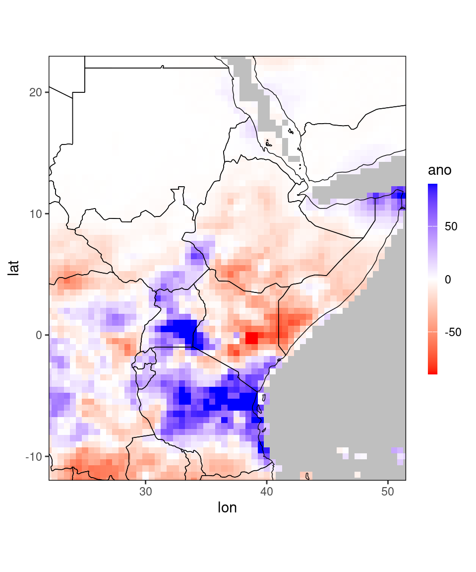
2.1 Controlling the colorscale
By default, ggplot_dt selects reasonable color scales if it recognizes the name of the column it plots. For example, above we saw that it selected reasonable colors for columns named prec, ano (positive values in blue, zero in white, negative values in red). We saw above that different colors were selected for the column terc_cat (which are more in line with verification maps). We can also customize the selected colors with the arguments low,mid, and high. An overview over available color names can be found here.
ggplot_dt(dt[month == 11 & year == 2020], 'ano',
          mn = 'November 2020 rainfall anomaly',
          rr = c(-90,90),
          low = 'salmon', mid = 'gold', high = 'darkgreen',
          name = 'mm')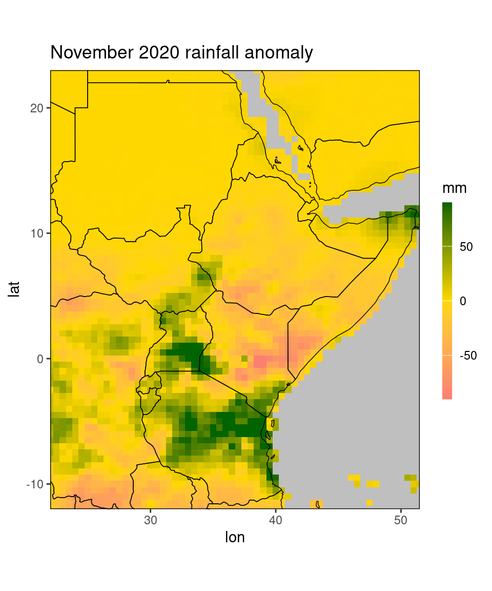
Note that we set the range argument to c(-90,90). Fixing the range mostly makes sense when the range is known (e.g. for correlation plots), or when you want to compare several plots (e.g. for comparing mean square error of different NWP models, all plots should have the same range). If we leave the range argument rr free, the range is determined from the data.
Additionally, we can use the midpoint argument to determine the midpoint of the color scale (the value that centers the middle color, white by default).
Finally, the function allows to discretize the color scale. To this end the argument discrete_cs is set to TRUE. We can control the breaks of the discrete colorscale
by one of the arguments binwidth, n.breaks, or breaks (the latter takes a vector containing all breakpoints).
Using breaks or binwidth is recommended: The argument n.breaks (which is passed to the function ggplot2::scale_fill_steps2)
tries to find ‘nice’ breaks and does not work reliably. To revisit the anomaly plot from above:
ggplot_dt(dt[month == 11 & year == 2020], 'ano',
          mn = 'November 2021 rainfall anomaly',
          discrete_cs = TRUE, binwidth = 60,
          low = 'red', mid = 'white', high = 'darkgreen',
          midpoint = 0,
          name = 'mm')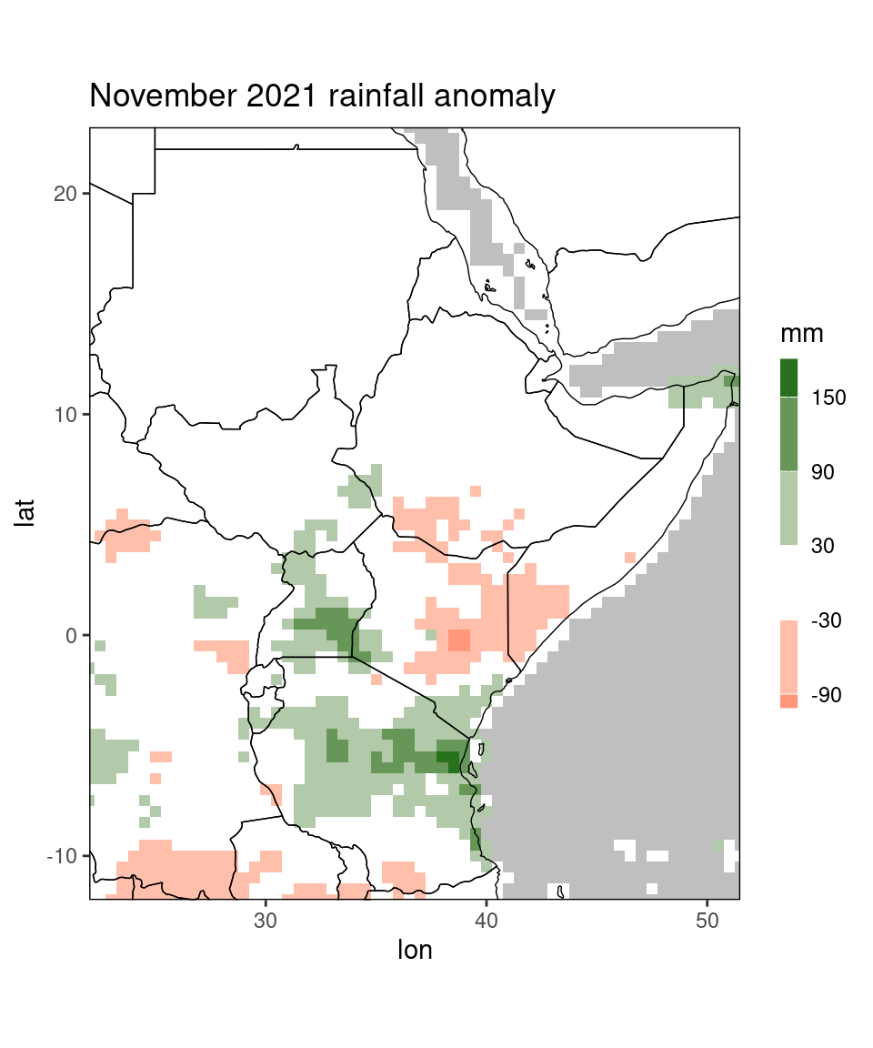
For saving a created plot, we can either use the function ggplot2::ggsave() or any of Rs graphical devices, e.g.
pdf(file = '<path to file and filename>.pdf', width = ...,height = ...)
  print(pp)
dev.off()
This creates a .pdf file, but you can print .png and some other file formats similarly, see ?Devices for an overview.
2.2 Plotting values for selected countries
Above, we have already seen an option how to restrict a plot to a particular country: by manually subsetting the data to a rectangle of longitudes and latitudes containing that specific country. This is of course quite tedious, and to make our lives easier we can use the restrict_to_country-function that takes a data table and a country name, and subsets the data table to only contain gridpoints in the specified country. Country names should be capitalized and in English: e.g. Burundi, Eritrea, Ethiopia, Kenya, Rwanda, Somalia, South Sudan, Sudan, Tanzania, Uganda.
dt_new = restrict_to_country(dt[month == 11 & year == 2020],'Kenya')
ggplot_dt(dt_new, 'ano',
          mn = 'November 2020 rainfall anomaly',
          discrete_cs = TRUE, midpoint = 0, binwidth = 60)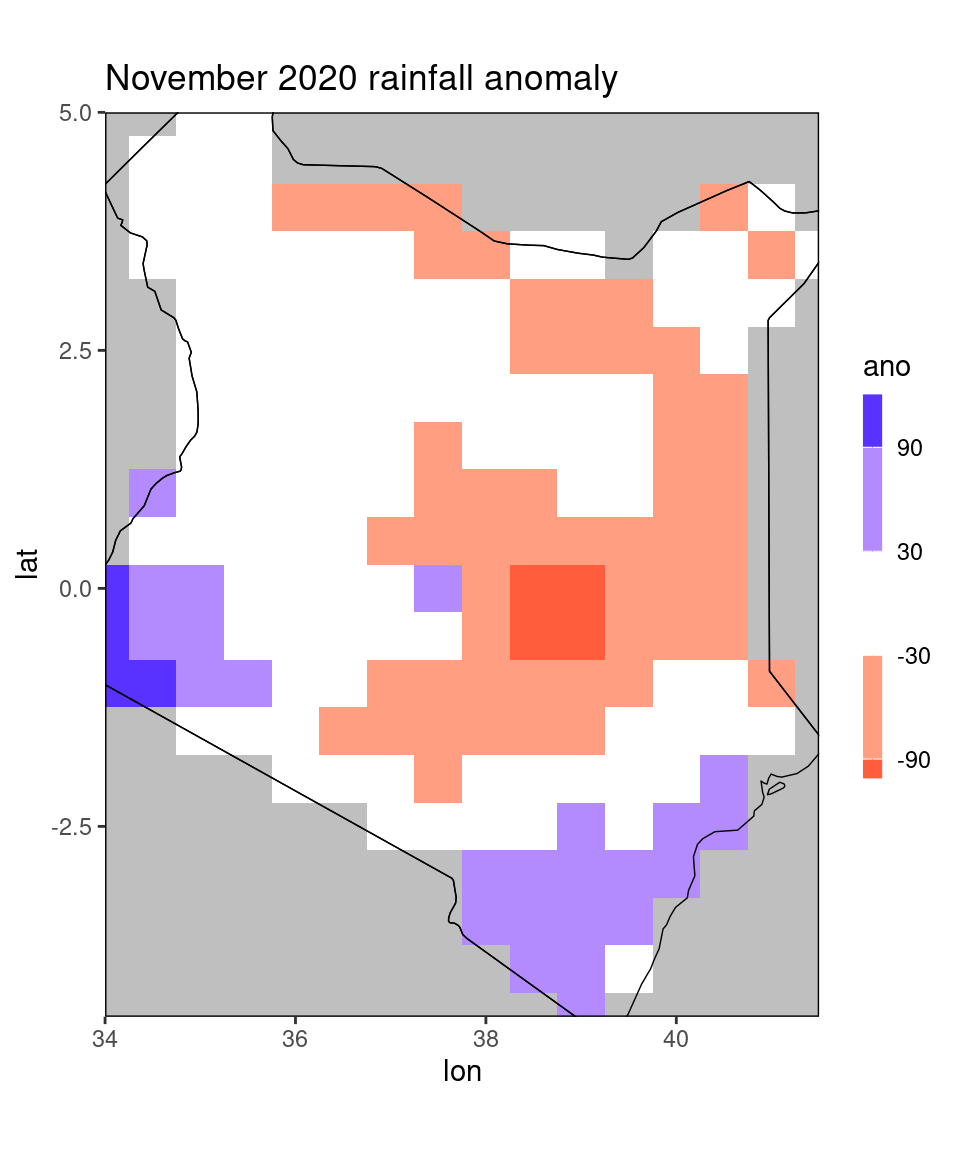
As we can see, the function restricts the data to all gridcells for which the centerpoint lies within the specified country. This is useful, for example, for calculating mean scores for the specified country. However, it is not optimal for plotting, since all grid cells past the border are censored, even though the original data table contained values there. To this end, the restrict_to_country function has a rectangle-argument that you can set to TRUE for plotting:
dt_new = restrict_to_country(dt[month == 11 & year == 2020],'Kenya', rectangle = TRUE)
ggplot_dt(dt_new, 'ano',
          mn = 'November 2020 rainfall anomaly',
          discrete_cs = TRUE, midpoint = 0, binwidth = 60)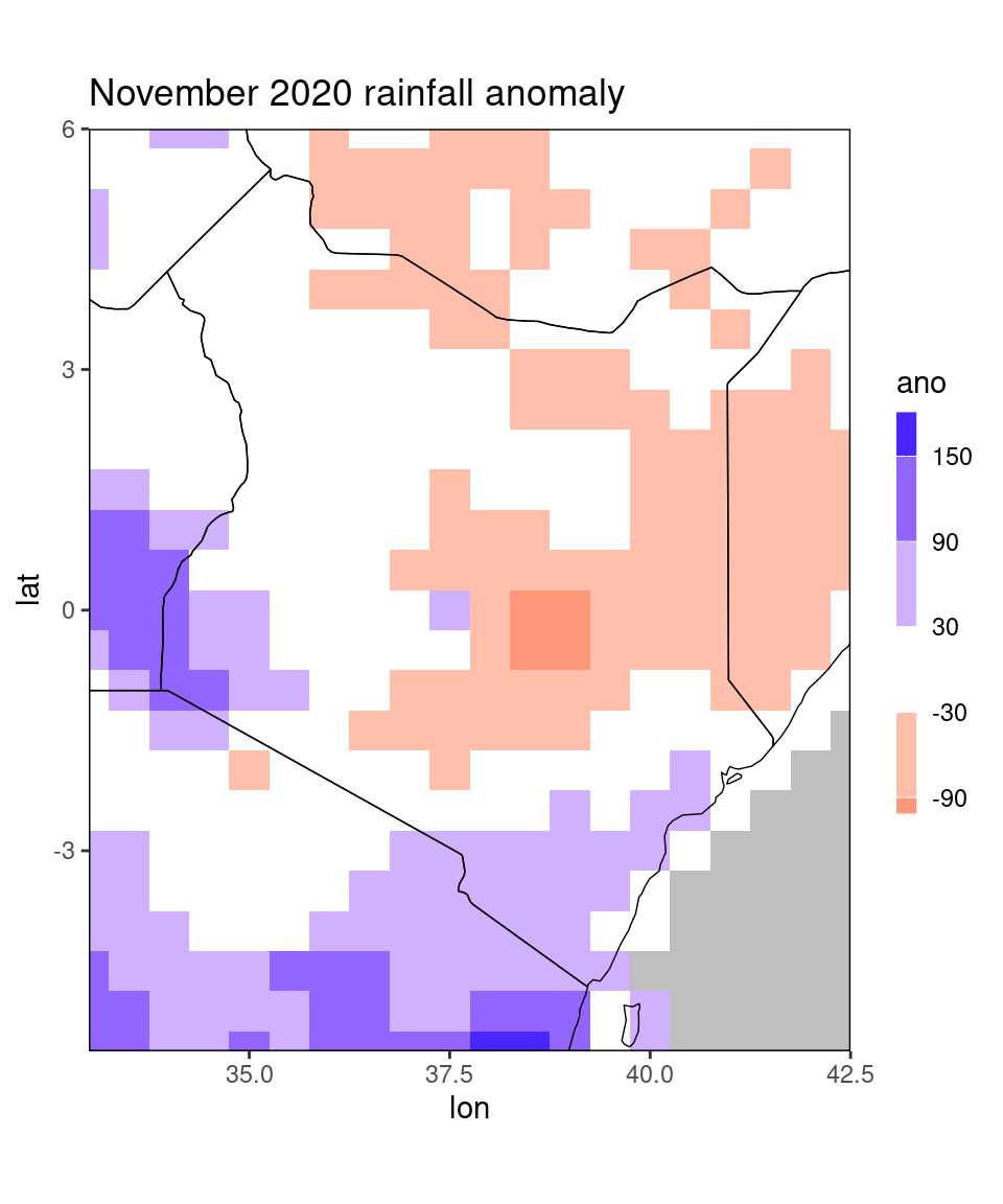
Instead of a single country name, you can also pass multiple country names in a vector to the function. Moreover, when you use rectangle = TRUE, you can specify a tolerance tol in order to widen the plotting window:
dt_new = restrict_to_country(dt[month == 11 & year == 2020],
                             c('Kenya','Tanzania'),
                             rectangle = TRUE,tol = 2)
ggplot_dt(dt_new, 'ano',
          mn = 'November 2020 rainfall anomaly',
          discrete_cs = TRUE, midpoint = 0, binwidth = 50)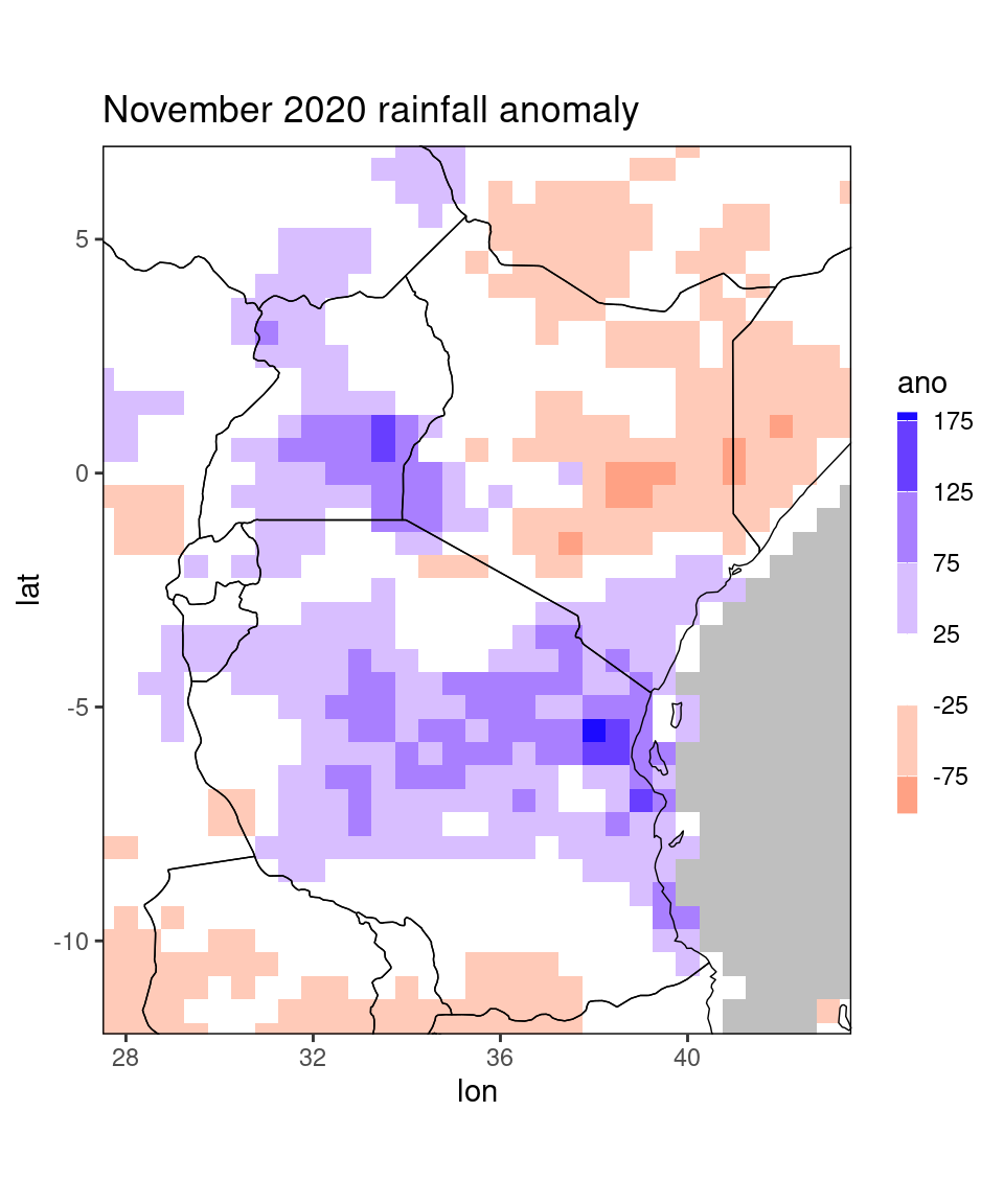
The tol = 2 argument means that the function will include a buffer zone of 2 degrees lon/lat outside the specified countries (i.e. 4 gridpoints to each side). Note that the buffer to the south of Tanzania is smaller, because the original data table dt does not contain any data further south.
2.3 Customized plots
The function ggplot_dt is, as its name suggests, based on the package ggplot2. This is a widely-used package and there are many books and tutorials available for getting familiar with the syntax, e.g. https://ggplot2-book.org/. Besides printing out a plot, the function also returns this plot as a gg-object, which can be further modified. In ggplot2, plots are composed out of multiple layers, allowing for successive adding of layers. This can help us to generate highly customized plots. As an example, let’s revisit the anomaly plot from above and add the location of Nairobi an Addis Abbaba to it:
library(ggplot2)

# get locations as data table:
loc = data.table(name = c('Addis Abbaba','Nairobi'),
                 lon = c(38.77,36.84),lat = c(9,-1.28))
print(loc)
## name lon lat
## <char> <num> <num>
## 1: Addis Abbaba 38.77 9.00
## 2: Nairobi 36.84 -1.28pp = ggplot_dt(dt[month == 11 & year == 2020], 'ano',
mn = 'November 2020 rainfall anomaly',
low = 'red', mid = 'white', high = 'darkgreen',
midpoint = 0,
name = 'mm') +
geom_point(data = loc,mapping = aes(x = lon,y = lat)) +
geom_text(data = loc,mapping = aes(x = lon,y = lat,label = name),vjust = 1.5)
print(pp)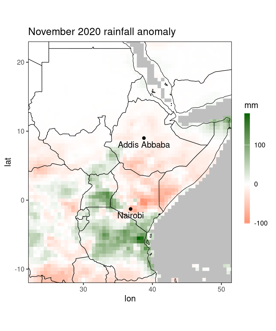
Here, we added two layers to the original plot, the first one being the geom_point-layer that creates the two points at the locations of the cities, and the second being the geom_text-layer that labels the points by the city names.
A frequently required operation is the changing of the font sizes of title and labels. The easiest way to do this is the command
theme_set(theme_bw(base_size = 16)) # defaults to 12
print(pp)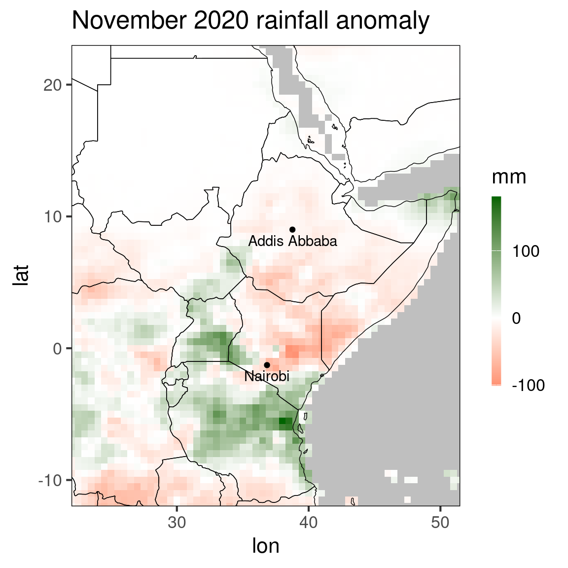
We can also use ggplots adding-layer-syntax to overwrite existing layers, for example if we want a fully customized colorscale:
library(viridis) # the viridis package contains some nice color scales
pp_new = pp + scale_fill_viridis(breaks = seq(-150,150,by = 20),
                                 guide = guide_colorbar(title = 'my personal color scale',
                                                        title.position = 'top',
                                                        barwidth = 20,
                                                        direction = 'horizontal')) +
              xlab('lon') + ylab('lat') +   # label axis
              theme(panel.background = element_rect(fill = 'salmon'), # change background color (used for missing values) to something whackey
                    axis.ticks = element_line(), # add ticks...
                    axis.text = element_text(),  # ... and labels for the axis, i.e. some lons and lats.
                    legend.position = 'bottom')

print(pp_new)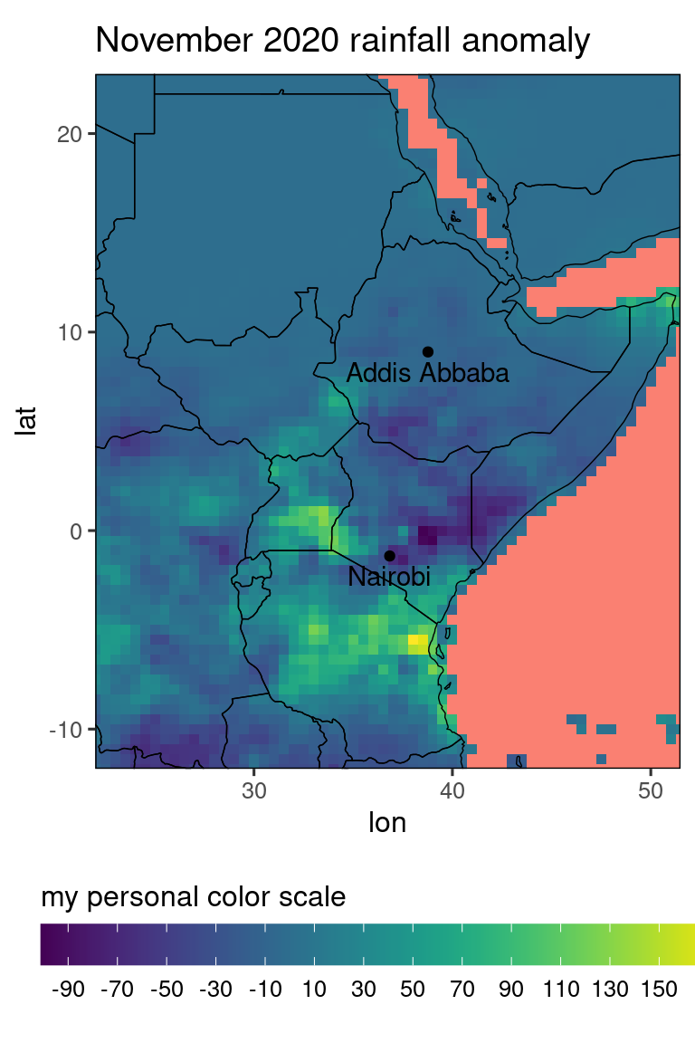
For comparing multiple plots (potentially all of them with the same legend), the function ggarrange from the package ggpubr is useful:
library(ggpubr)
# compare 2019 October anomaly to 2020 anomaly:
rr = c(-150,150) # force color scale to be identical for the plots

pp1 = ggplot_dt(dt[month == 11 & year == 2019], 'ano',
                rr = rr,
                mn = 'October 2019 rainfall anomaly',
                low = 'red', mid = 'white', high = 'darkgreen',
                guide = guide_colorbar(barwidth = 20,barheight = 1,direction = 'horizontal'),
                midpoint = 0,
                name = 'mm') +
  geom_point(data = loc,mapping = aes(x = lon,y = lat)) +
  geom_text(data = loc,mapping = aes(x = lon,y = lat,label = name),vjust = 1.5)

pp2 = ggplot_dt(dt[month == 11 & year == 2020], 'ano',
                rr = rr,
                mn = 'October 2020 rainfall anomaly',
                low = 'red', mid = 'white', high = 'darkgreen',
                midpoint = 0,
                name = 'mm') +
  geom_point(data = loc,mapping = aes(x = lon,y = lat)) +
  geom_text(data = loc,mapping = aes(x = lon,y = lat,label = name),vjust = 1.5)


ggarrange(pp1,pp2,ncol = 2,common.legend = TRUE,legend = 'bottom')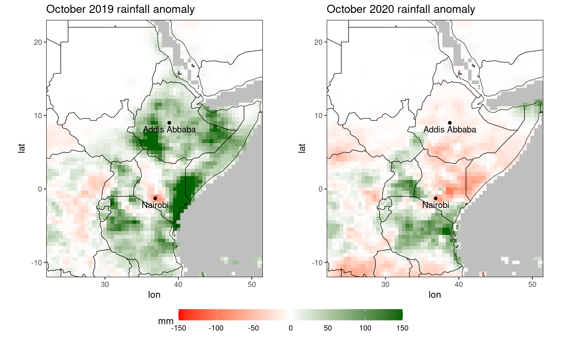
Similar functionality is provided by the patchwork package which we use in the next section.
2.4 Plots for the Greater Horn of Africa
This package was developed in collaboration with ICPAC. Three times a year, ICPAC hosts the Greater Horn of Africa Climate Outlook Forum (GHACOF),
discussing weather forecasts for the coming season with various stakeholders. For aiding this dissemination, SeaVal contains separate plotting function for the Greater Horn of Africa (GHA) region.
These functions use a higher-resolution map, which is part of the SeaVal package itself. The function gha_plot() works exactly as ggplot_dt, except that it uses this higher-resolution map:
gha_plot(chirps_monthly[year == 2020 & month == 12])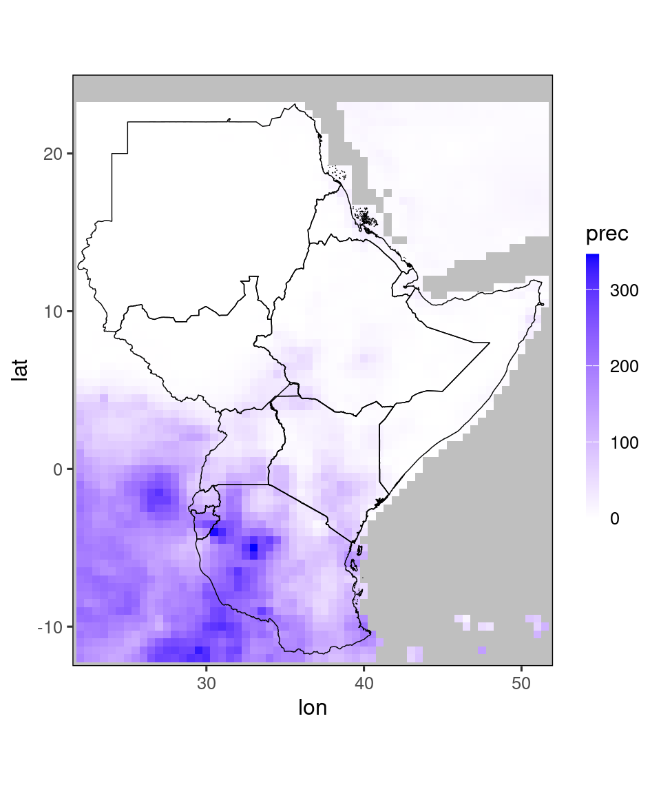
In this plot it looks a bit stupid that the data outside of the GHA-borders is shown. As discussed [Plotting values for selected countries][above], one way to solve this would be to use the restrict_to_country()-function,
by passing it the names of all countries in the GHA region. Luckily, we do not have to do this manually, but can use the shorthand restrict_to_GHA():
temp = restrict_to_GHA(chirps_monthly[year == 2020 & month == 12])
gha_plot(temp)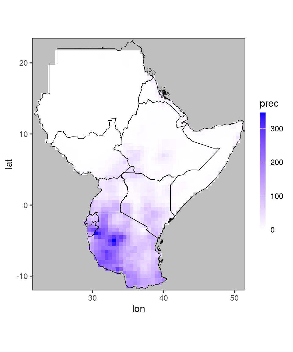
Internally, the gha_plot()-function calls ggplot_dt(), just changing the map. Therefore, everything discussed in the previous sections works exactly the same for gha_plot(). The main advantage of ggplot_dt() is that it uses a global map, so you can use it for visualizing data anywhere.
As already noted above, the chirps_monthly data has a terc_cat column, containing tercile categories for any given year. We can produce a separate plot for these using the tercile_plot()-function:
tercile_plot(temp)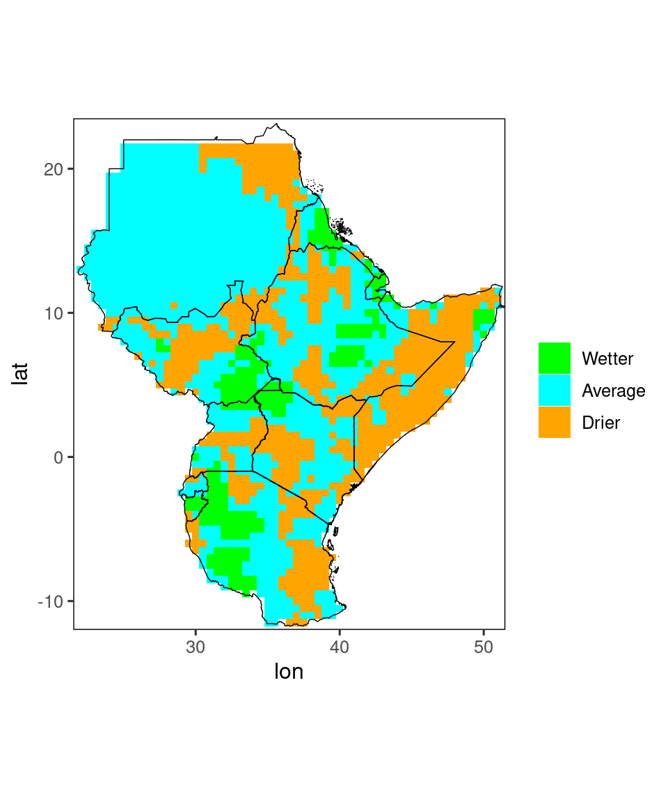
Also for this function you have a lot of options for finetuning your plots, e.g. if you prefer different colors for the three categories. See ?tercile_plot for details.
Finally, a special plot is available for showing tercile forecasts as a map. Such forecasts take the form of three probabilities - for the three categories ‘below normal’, ‘normal’ and above normal.
SeaVal expects you to store these probabilities in columns named below, normal, and above, respectively. It also expects you to use probabilities between 0 and 1 (not percent).
We discuss how to derive such forecasts using SeaVal in Section Getting your data into the right format. For the exposition here we can rely on the example dataset ecmwf_monthly which contains tercile probabilities predicted by ECMWFs SEAS5 system:
tercile_forecasts = ecmwf_monthly[year == 2020 & month == 12 & member == 1]
print(tercile_forecasts)
## lon lat year month prec member below normal above
## <num> <num> <int> <int> <num> <int> <num> <num> <num>
## 1: 22.0 13.0 2020 12 -0.06 1 0.48 0.36 0.16
## 2: 22.5 12.5 2020 12 -0.03 1 0.48 0.36 0.16
## 3: 22.5 13.0 2020 12 -0.06 1 0.44 0.36 0.20
## 4: 22.5 13.5 2020 12 -0.03 1 0.32 0.36 0.32
## 5: 22.5 14.0 2020 12 0.00 1 0.36 0.36 0.28
## ---
## 2064: 50.5 11.0 2020 12 13.26 1 0.36 0.36 0.28
## 2065: 50.5 11.5 2020 12 20.55 1 0.36 0.24 0.40
## 2066: 51.0 10.5 2020 12 28.47 1 0.32 0.40 0.28
## 2067: 51.0 11.0 2020 12 17.94 1 0.36 0.40 0.24
## 2068: 51.0 11.5 2020 12 25.23 1 0.36 0.28 0.36We see that the data table contains columns below, normal and above, so one way of visualizing the prediction is by plotting three maps for these three values.
Here, we use the patchwork package to combine several plots into a single plot:
library(patchwork)
p1 = gha_plot(tercile_forecasts, 'below')
p2 = gha_plot(tercile_forecasts, 'normal')
p3 = gha_plot(tercile_forecasts, 'above')

pp = p1 + p2 + p3 # this syntax is enabled by patchwork
plot(pp)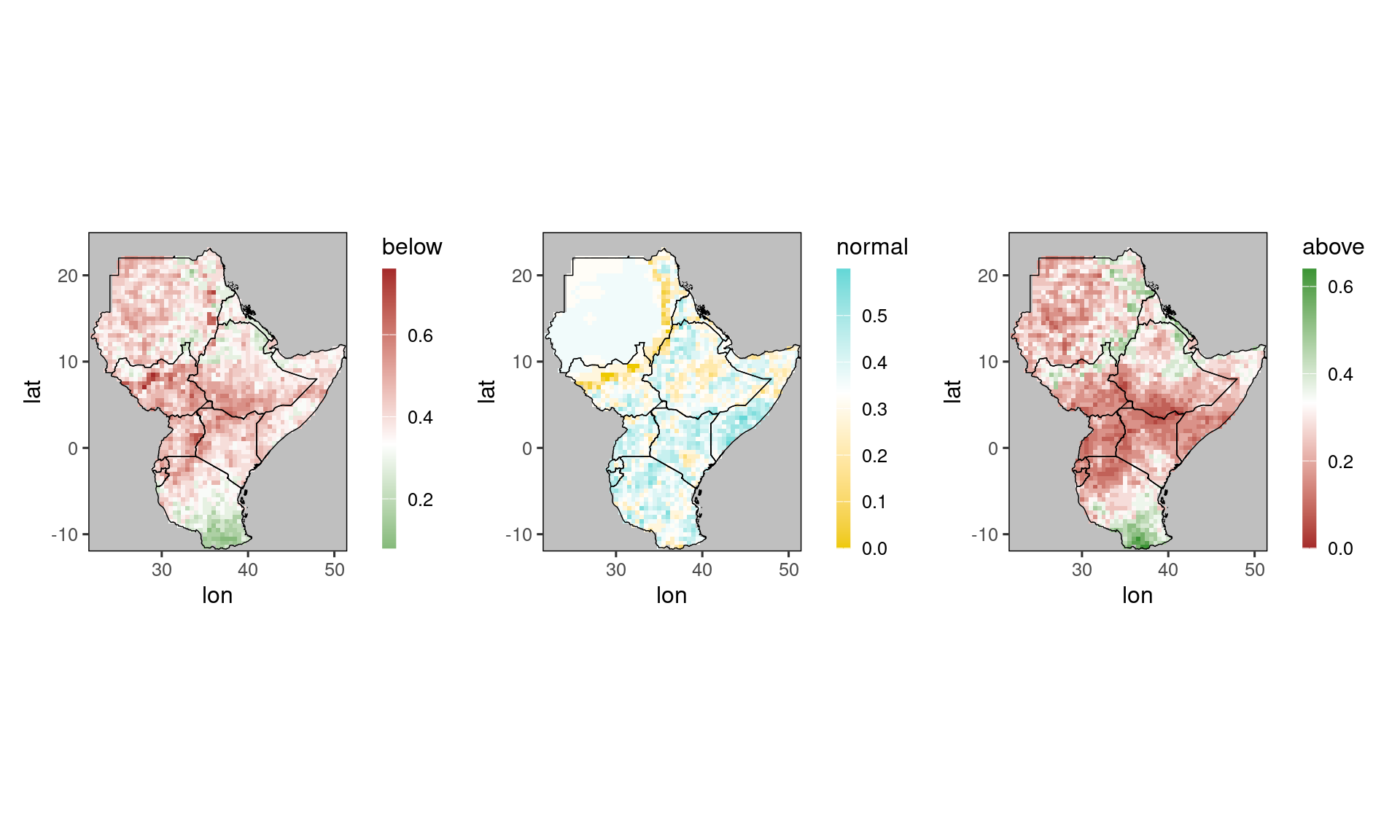
Note how gha_plot() automatically selects different color scales for the three plots, because it recognizes the column names above, normal, and below. In particular, all scales are centered around 0.333 (=white),
which is the climatological forecast.
Looking at three plots can be somewhat overwhelming. Therefore, at GHACOFs these are usually compressed into a single plot, which shows for each gridpoint only the most probable category (and its probability).
These plots can be generated using the function tfc_gha_plot() (for tercile-forecast-GHA-plot):
tfc_gha_plot(tercile_forecasts)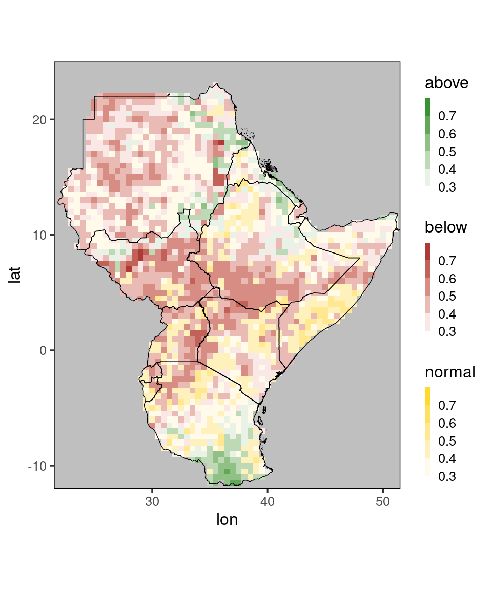
Again, the default behavior of this function (e.g. using discrete color scales) can be flexibly modified, see ?tfc_gha_plot for details. There is also a version of this function using the global map of ggplot_dt, namely tfc_plot.