Chapter 5 Validation
In this section we give examples how to evaluate seasonal forecasts with SeaVal.
Among the most important seasonal forecast products for East Africa are probabilistic forecasts whether the coming season will see below normal-, normal-, or above normal rainfall.
These three categories are defined by climatological terciles, below normal meaning that the the year was dryer than 2/3 of all observed years in a climatological reference period.
Therefore, we call these type of predictions tercile forecasts.
One of the key tasks addressed by SeaVal is the evaluation of such forecasts, but also other forecast types are supported.
For our examples, we will stick to tercile forecasts of rainfall, but tercile forecasts of other variables can be evaluated exactly the same way.
There are many different properties a ‘good’ prediction should possess (e.g. discrimination, reliability, sharpness). Therefore, different evaluation metric focus on different forecast properties, and which metric is appropriate depends on the situation at hand. Discussing forecast properties and aspects of forecast evaluation is beyond the scope of this tutorial, as are detailed explanations of single evaluation metrics such as reliability diagrams.
We recommend to read the WMO recommendations on evaluating Seasonal Climate Forecasts, which discusses in detail aspects of evaluating tercile forecasts. SeaVal has been developed with these recommendations in mind, and provides implementations of all of the various evaluation metrics discussed in this document.
In particular, these recommendations and the references therein explain essentially all evaluation metrics implemented in SeaVal and demonstrated below.
An exception to this is the Multicategory Brier Score, which is not covered in the recommendations but is implemented in SeaVal.
It constitutes a proper score that has some advantages over other proper scores often used in these context (log-score and RPS). More details on this below.
5.1 general approach
Generally, most evaluation tools output either a diagram (popular examples being reliability diagrams or ROC-curves) or a single number, the score (for example the correlation between forecast and prediction or the log-likelihood score).
In general, diagrams provide more diagnostic details about strength and weaknesses of a forecast (but typically require some practice to get used to).
Scores, on the other hand, provide less details, but are typically easy to understand (e.g. higher correlation means more discrimination).
Moreover, when the best system out of competing forecast systems should be selected, one can formally show that this decision should be based on scores that are proper, see ….
The only evaluation tool provided by SeaVal not fitting either of the categories diagram or score are verification maps.
These maps plot the observed rainfall as climatology-quantile, making it easy to see where a season was dry or wet, and making it easy to visually compare to the tercile forecast for this season.
Note, however, that verification maps are based on observations only, and therefore do not validate a forecast.
All evaluation functions take a data table as input, which needs to contain observations and predictions side by side, see last section for how to get to such a data table.
The functions then expect certain column names for the columns containing predictions ('below', 'normal', 'above' for tercile probabilities) and observed tercile categories ('terc_cat' or 'tercile_category' or a few other variants, see tc_cols()). If your data table has differently named columns and you don’t want to change that, you can use the f- and o-argument which are shared by all evaluation functions. For example, if you want to construct the reliability diagram and your data is stored in a data table dt, in which the predicted tercile probabilities are named 'b','n' and 'a', and the observed tercile category is named 'obs', then the correct function call would be rel_diag(dt, f = c('b','n','a'), o = 'obs').
One key advantages of SeaVal is that it makes it easy to group while calculating evaluation metrics.
Essentially grouping by a dimension variable means that you evaluate the forecast separately for each instance of this variable. Typical examples would be
- grouping by
month: Evaluate the forecasts for each month separately - grouping by
lonandlat: Evaluate the forecasts separately for each gridpoint - grouping by
country: Evaluate the forecasts for each country separately - no grouping: everything is pooled together.
What level of grouping is appropriate, does not only depend on what you’re interested in, but also on what evaluation metric you are looking at.
If you have five years of forecasts and observations, it simply makes no sense to create reliability diagrams for each gridpoint separately - both because for a single gridpoint you don’t have enough data but also because these are just too many diagrams to look at.
All evaluation functions in SeaVal select reasonable defaults for grouping for you. Additionally, they all have an argument called by (motivated from data.tables syntax, see [Section 1.2][dt-syntax]), where you can specify different column names to group over.
For presenting the evaluation methods, we create an evaluation data table from the two example data tables chirps_monthly and ecmwf_monthly contained in the package
# take ecmwf_monthly and get rid of ensemble forecast:
tfc = unique(ecmwf_monthly[,.(lon,lat,year,month,below,normal,above)])
# select relevant columns in chirps_monthly:
obs = chirps_monthly[,.(lon,lat,month,year,terc_cat)]
#combine:
dt = combine(tfc,obs)
print(dt)
## Key: <lat, lon, month, year>
## lat lon month year below normal above terc_cat
## <num> <num> <int> <int> <num> <num> <num> <int>
## 1: -11.5 35.0 11 2018 0.16 0.28 0.56 0
## 2: -11.5 35.0 11 2019 0.12 0.36 0.52 0
## 3: -11.5 35.0 11 2020 0.44 0.40 0.16 -1
## 4: -11.5 35.0 12 2018 0.16 0.36 0.48 0
## 5: -11.5 35.0 12 2019 0.12 0.40 0.48 1
## ---
## 12404: 23.0 35.5 11 2019 0.24 0.44 0.32 1
## 12405: 23.0 35.5 11 2020 0.36 0.40 0.24 0
## 12406: 23.0 35.5 12 2018 0.20 0.40 0.40 0
## 12407: 23.0 35.5 12 2019 0.40 0.40 0.20 0
## 12408: 23.0 35.5 12 2020 0.40 0.28 0.32 -1This data table contains tercile forecasts and observed tercile categories for November and December 2018-2020, for the GHA-region:
dt_sub = dt[year == 2020 & month == 11]
p1 = gha_plot(dt_sub,'below')
p2 = gha_plot(dt_sub,'normal')
p3 = gha_plot(dt_sub,'above')
ggpubr::ggarrange(plotlist = list(p1,p2,p3),ncol = 3)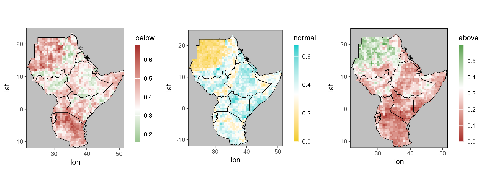
Note that ggplot_dt automatically selects different color scales for the three forecasts, all of which are white at 0.33, corresponding to a climatological forecast for the corresponding category.
In particular, note that the color scales for above and below are reversed, green suggesting wetter than normal and brown drier.
5.2 Diagrams for tercile forecasts
The most important diagrams for forecast evaluation are reliability diagrams and ROC-curves. Reliability diagrams are generated by the function rel_diag:
rel_diag(dt)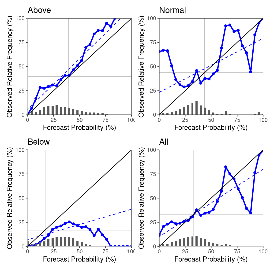
As you can see, the diagrams are derived for all three categories separately, as well as one diagram pooling all categories together. The appearence of the diagrams is inspired from the WMO recommendations, where you can also find a detailed description of what they show and how to interpret them.
The default of the rel_diag-function is to pool all dimension variables, which means the diagrams are generated from forecasts from all locations and both November and December. The easiest way of changing this is using data table subsetting. E.g., if we want to look at only the November predictions for Kenya, we get this as follows:
dt_ken = restrict_to_country(dt, 'Kenya')
rel_diag(dt_ken[month == 11])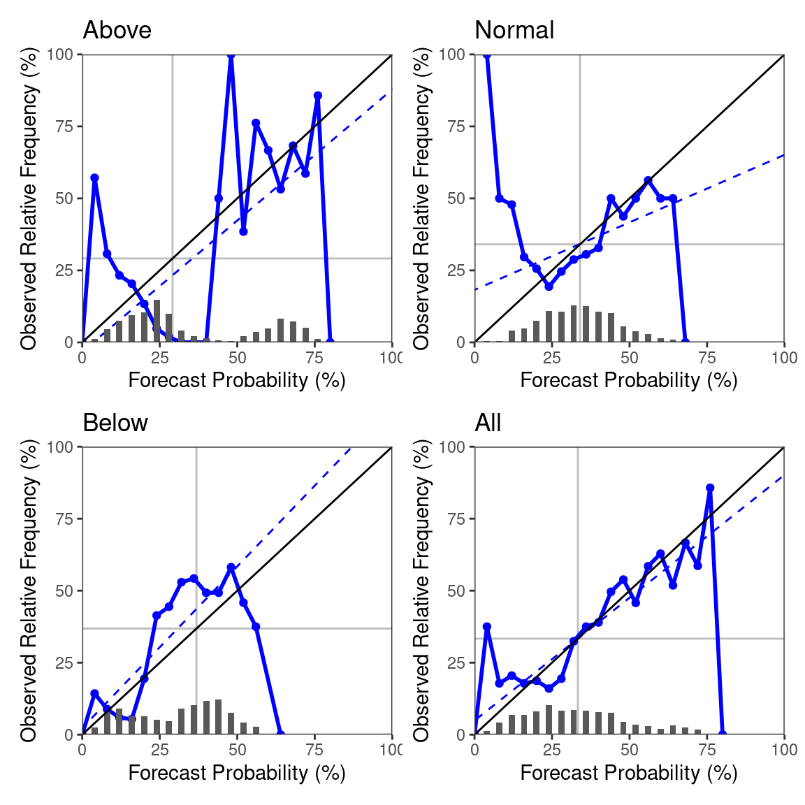
As discussed above, we can group the calculation using the ‘by’-argument. For example, we can look at reliability diagrams for each of the three years separately using by = 'year'.
Because a lot of plots are generated when you group (number of grouping levels times 4, one for each the above, normal, below, and all-category), the plots are returned as a list of gg-objects:
plot_list = rel_diag(dt, by = 'year')
length(plot_list)
## [1] 12# plot the reliability diagrams for the above-category:
ggpubr::ggarrange(plotlist = plot_list[c(1, 5, 9)], ncol = 3)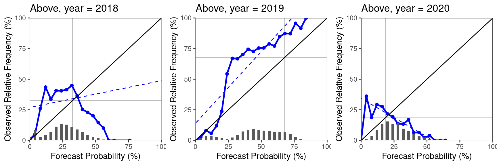
Note that SeaVal also has a function rel_diag_vec to derive general reliability diagrams from a vector of probabilities and a vector of corresponding categorical observations.
The function for calculating ROC-curves is called ROC_curve. It follows the same logic when it comes to subsetting and grouping, so we don’t go further into detail here.
ROC_curve(dt)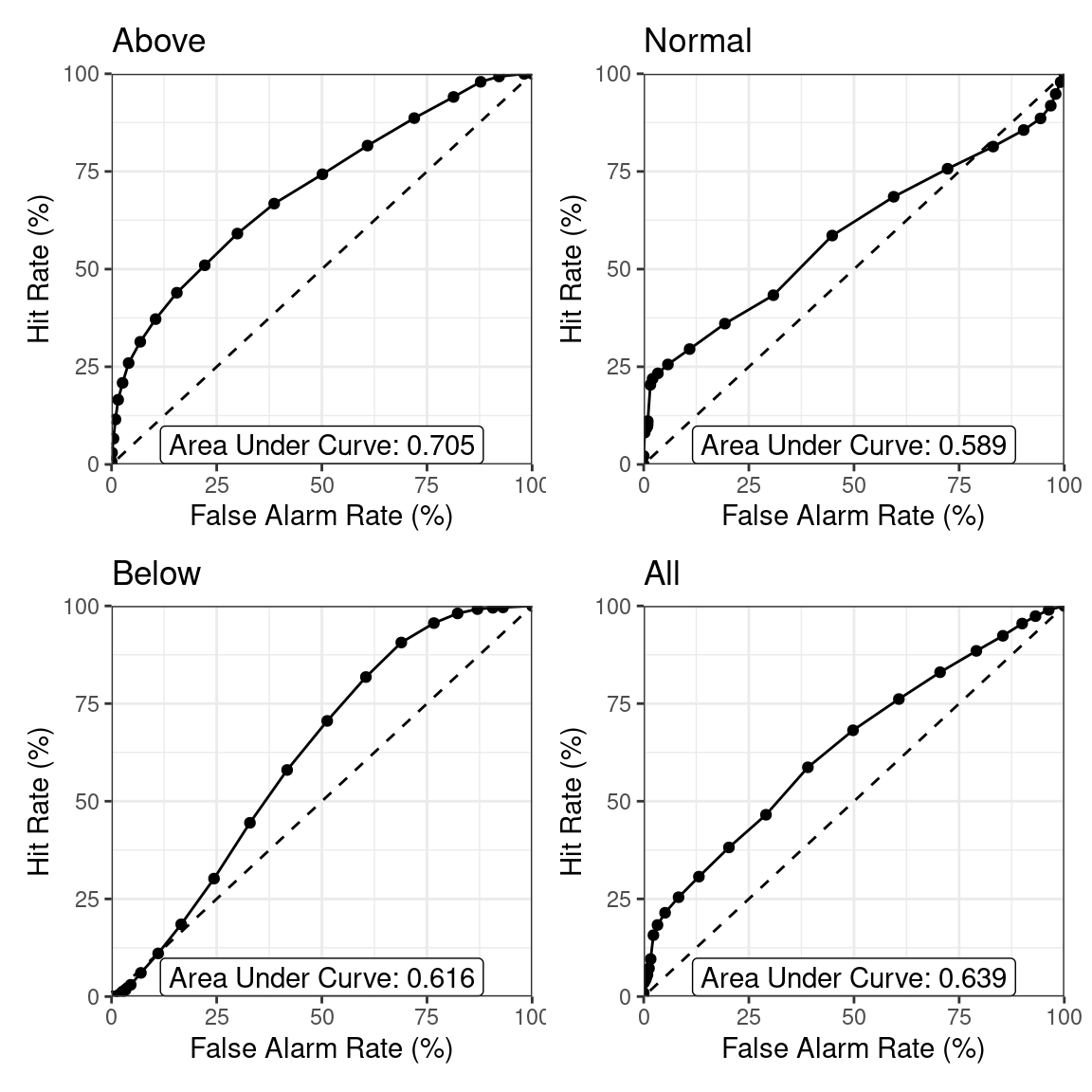
Other diagrams suggested in the WMO recommendations are (accumulative) profit graphs (function profit_graph, with an optional argument 'accumulative') and tendency diagrams (function tendency_diag). Profit graphs are frequently difficult to interpret when you have multiple locations (and therefore many forecast-observation-pairs).
Therefore, we subset to the gridpoint containing Nairobi for demonstrating them:
profit_graph(dt[lon == 37 & lat == -1.5])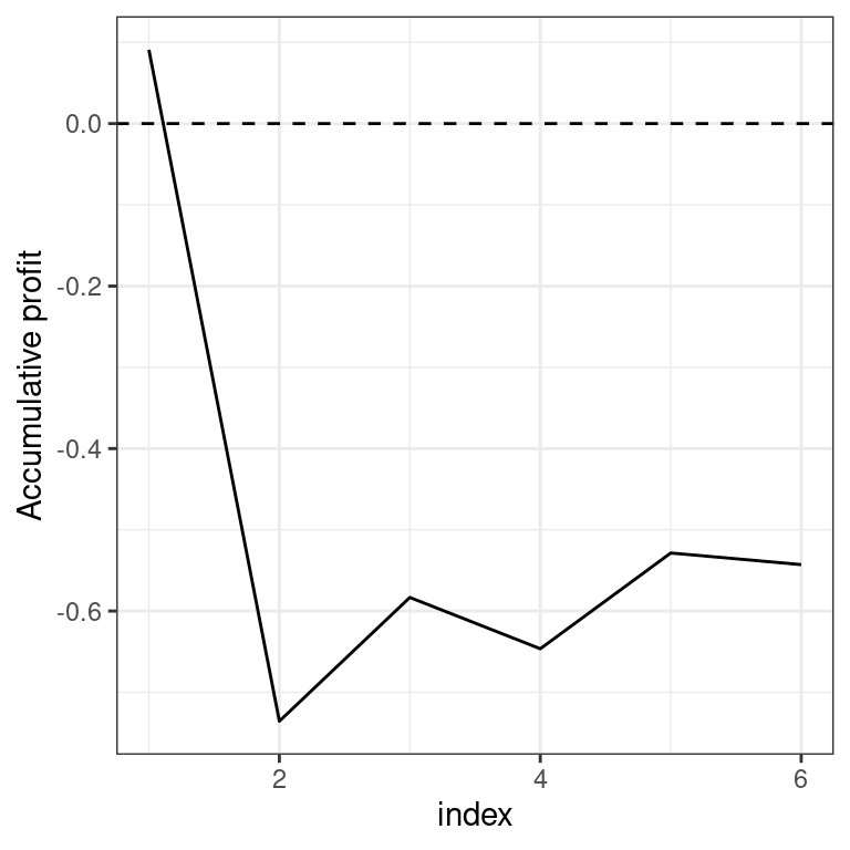
profit_graph(dt[lon == 37 & lat == -1.5], accumulative = FALSE)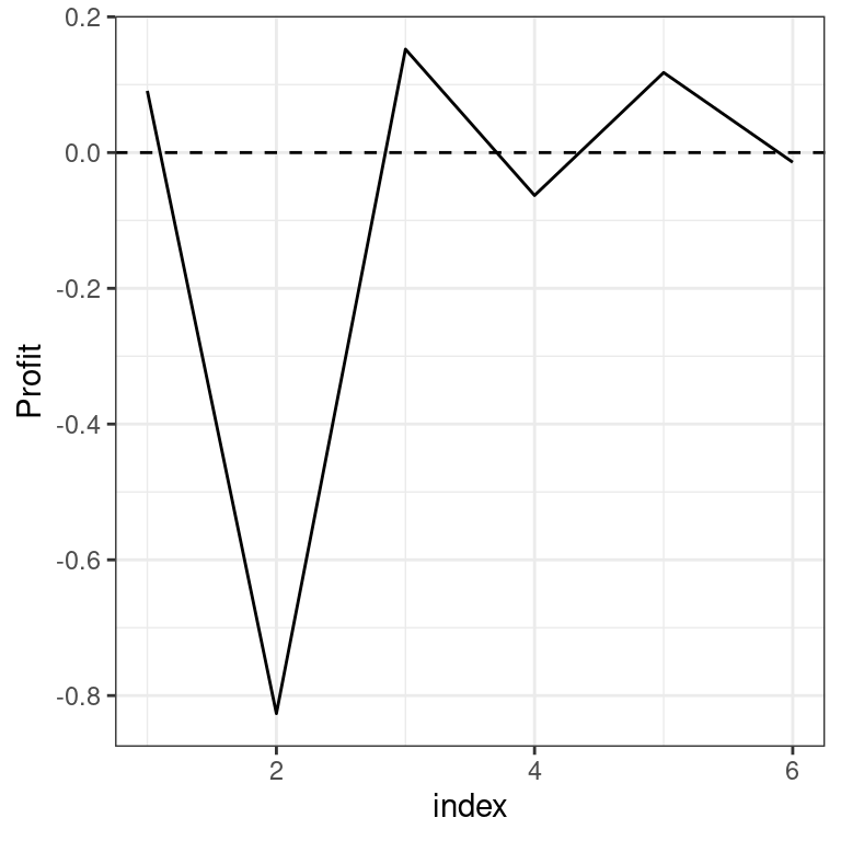
tendency_diag(dt)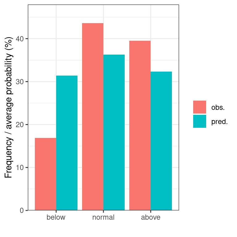
5.3 Scores for tercile forecasts
By scores we mean any validation tool that returns a number. Typical examples are the ignorance score (or log-likelihood) or the ROC-score (or area under curve/AUC). Some scores such as the ignorance score directly indicate ‘goodness’ of the forecast in the sense that better forecasts achieve on average better scores. Such scores are called proper. Other scores, such as the ROC-score evaluate properties such as the resolution of the forecast, but are agnostic towards other properties (in this case bias) of the forecast. See the WMO recommendations for an overview of scores, their properties and how to use them.
The syntax is similar to diagrams, in that you just feed the data table with forecasts and observations to the function deriving the score. Each score has a sensible default for grouping that may vary between different scores: While for some scores such as the ignorance score it is reasonable to derive the score for each gridpoint separately, this makes little sense for the ROC-score, since it requires many observations before it becomes informative, so it requires spatial pooling.
There is a range of improper1 scores implemented. Please see also function documentation for details:
DISS: the generalized discrimination score,EIR: the effective interest rate,REL: the reliability score,RES: the resolution score,ROCS: the ROC-score (or area under curve/AUC),SRC: the slope of the reliability curve.
Each of these scores evaluates different aspects of the forecast, we don’t go into further detail here. However, it is important to keep in mind that they do not simultaneously evaluate all aspects of a forecast. It is, therefore, problematic to just consider one of these scores and assume the forecast with the best score is somehow the best score. For example, if a forecast has a high ROC-score, it has good discrimination, essentially meaning that the forecast carries information about the outcome. Nevertheless, it can still be very biased and, for example, always predict extremely high probabilities for above normal rainfall.
This is the advantage of scores that are proper. Such scores systematically prefer forecasts that are better in a strictly defined mathematical sense.
The proper scores available in SeaVal are
HS: the hit score (at what frequency did the most likely category get hit)IGS: the ignorance scoreMB: the multicategory Brier score (see below)RPS: the ranked probability score
Here, for the hit score higher values indicate better performance, for all other scores lower values indicate better performance
Proper scores are often transformed into skill scores.
For skill scores, the optimal value (achieved by a perfect prediction) is 1, and a climatological forecast achieves a skill score of 0. Higher skill scores indicate better forecasts.
Thus, negative skill scores indicate worse predictions than climatology, positive skill scores better than climatology.
Skill scores are easier to interpret. In the context of tercile forecasts, the skill scores for the hit score, ignorance score and multicategory Brier score are proper scores themselves (positively oriented).
This is due to the fact that for a climatological prediction (by definition (1/3,1/3,1/3)) the score is the same for any outcome.
This is not the case for the ranked probability score, where a normal outcome achieves a different score than above or below normal.
For this reason it is recommended not to use the ranked probability score. Ignorance and multicategory Brier score carry more information than the hit score, which is just based on the category with the highest predicted probability.
Of these two, the ignorance score struggles with predicted zero-probabilities, which lead to skill scores of \(-\infty\).
This often can become cumbersome when scores are averaged over multiple years, months or locations.
The multicategory Brier score avoids all of these disadvantages. We therefore recommend to use the multicategory Brier skill score as main score for evaluation.
Skill scores for the scores above are obtained from the functions HSS, IGSS, MBS and RPSS.
Let us look at a few scores for the November predictions from our example data table dt:
p1 = gha_plot(MBS(dt)[month == 11], rr = c(-1,1), mn = 'Multicategory Brier skill score')
p2 = gha_plot(HSS(dt)[month == 11], rr = c(-1,1), mn = 'Hit skill score')
p3 = gha_plot(IGSS(dt)[month == 11], rr = c(-1,1), mn = 'Ignorance skill score')
p4 = gha_plot(EIR(dt)[month == 11], rr = c(-1,1), mn = 'Effective interest rate')

ggpubr::ggarrange(plotlist =list(p1, p2, p3, p4), ncol = 2, nrow = 2)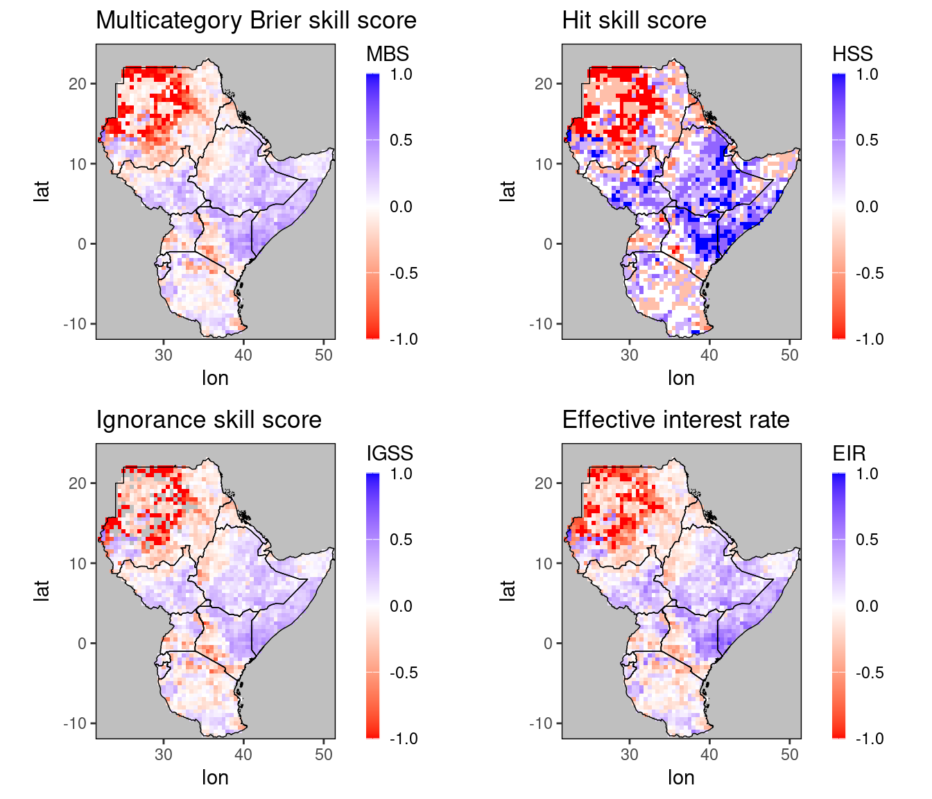
We can see that all these scores agree that all forecasts were good over Somalia, large parts of Ethiopia, and western Kenya. The bad performance over the Sahara should not really bother us when it comes to precipitation forecasts. Note, however, that the ignorance skill score is negative \(\infty\) for some of these gridpoints, namely the gridpoints in the Sahara desert plotted in gray. In general, this can make working with it awkward. For example, if we try to plot the ignorance skill score without fixing the range, we’ll get an error.
5.4 The multicategory Brier score
Since it is not featured in the WMO recommendations, we briefly describe how to calculate the multicategory Brier (skill) score. As mentioned above, its main advantage over the ignorance score is that it always returns finite values. Moreover, it can be shown mathematically, that the multicategory Brier score is the only proper score that is not badly affected when probabilities are rounded (e.g. to multiples of 5%), as is frequently the case in seasonal forecasts. Generally, it is less sensitive to outliers than the ignorance score, meaning that the ignorance score gives a larger penalty to the occurrence of events with low predicted probability. Despite these differences, the scores typically agree whether a forecast is better or worse than climatology, as we can see in the figure above.
The multicategory Brier score is defined as \[\text{MB} := (p_1 - e_1)^2 + (p_2 - e_2)^2 + (p_3 - e_3)^2.\] Here, \(p_1,p_2,\) and \(p_3\) are the predicted probabilities for the three categories, and \(e_i\) is 1 if the observation falls in the \(i\)th category, and 0 else. For example, if the observation falls into the first category, the multicategory Brier score would be \[(p_1 - 1)^2 + p_2^2 + p_3^2.\]
This score is strictly proper, meaning that it rewards calibration and accuracy. In our particular situation, the climatological forecast is uniform (since climatology is used to define the tercile categories), and the climatological forecast (1/3,1/3,1/3) always gets a multicategory Brier score of 2/3. It is therefore very convenient to consider the Multicategory Brier Skill Score (MBS) \[MBS := \frac{3}{2}(2/3 - \text{MB}).\] Like other skill scores, this score is normalized in the sense that a perfect forecaster attains a skill score of 1 and a climatology forecast always gets a skill score of 0. Since the MBS is just a linear transformation of the MB, but is way easier to interpret, there is not really a reason to ever calculate the MB.
5.5 Verification maps
The third type of validation tool, besides diagrams or scores, are verification maps. These are just plots of the observed rainfall, as quantiles relative to the climatological distribution. They make it easy to see where rainfall was in fact above or below normal.
To derive climatological quantiles, we need to load more than one year of observation.
The following example works if you have downloaded CHIRPS data, see the [CHIRPS-section][chirps]. In general, you need a data table with at least 10 years of observations.
If you have this, you can automatically generate a verification map using the ver_map-function:
## null device
##           1
# get observations (example chirps dataset for December):
chirps = chirps_monthly[month == 12]
#verification map for 12/2022:
ver_map(chirps)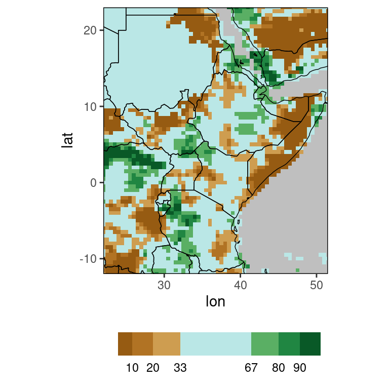

Here, the brown grid points show where precipitation was below normal, blue shows grid points with normal rainfall and green shows above normal rainfall, with darker brown/green indicating more extreme observations. The ver_map function by default considers all years available in the data table to calculate the reference climatology, and plots the verification map for the last available year. So the plot above is the verification map for December 2022. These defaults can of course be changed, see function documentation.
5.6 Scores for evaluating ensemble forecasts
Besides the various evaluation metrics for tercile forecasts mentioned above, SeaVal provides a range of scores applicable to ensemble forecasts.
These can be ensemble forecasts for precipitation, surface temperature, or any other real-valued quantity. They can also be applied to
point forecasts (essentially best-guess predictions), which essentially constitute an ensemble with only one member.
The format expected by SeaVal still mostly assumes monthly or seasonal forecasts (column names month and year will be recognized, date will not).
This is by design: SeaVal works with data tables which become very long when you work with daily data.
Nevertheless, the functions presented here can, in principle, be applied to any ensemble forecast, as long as you specify the arguments correctly.
All of these functions have the four arguments f, o, by,pool,mem:
f,ospecify the column names of the forecast and observation,by, the column names for dimension variables to group by,pool, the column names for dimension variables to pool,mem, the name of the column specifying the ensemble member.
For evaluating ensemble forecasts you want your data to look something like this:
## Key: <lat, lon, month, year>
##          lat   lon month  year   obs member   pred
##        <num> <num> <int> <int> <num>  <int>  <num>
##     1: -11.5  35.0    11  2018 33.99      1  93.15
##     2: -11.5  35.0    11  2018 33.99      2  67.68
##     3: -11.5  35.0    11  2018 33.99      3 168.42
##     4: -11.5  35.0    11  2019 62.07      1 128.88
##     5: -11.5  35.0    11  2019 62.07      2  78.63
##    ---
## 37220:  23.0  35.5    12  2019  3.75      2   3.81
## 37221:  23.0  35.5    12  2019  3.75      3   1.56
## 37222:  23.0  35.5    12  2020  3.24      1   4.59
## 37223:  23.0  35.5    12  2020  3.24      2   5.91
## 37224:  23.0  35.5    12  2020  3.24      3   0.30
Note how the same observation is repeated for each member of the ensemble forecast (one of the reasons why this dataformat is not appropriate for daily data).
Essentially, you again have a few dimension variables, a column member, and forecasts and observations.
For data in this format, we have the following scores available:
CPA- Coefficients of Predictive AbilityCRPS- Continuous Ranked Probability ScoreCRPSS- Continuous Ranked Probability Skill ScoreMSE- Mean Squared ErrorMSES- Mean Squared Error Skill ScorePCC- Pearson Correlation Coefficient
For skill scores CRPSS and MSES, the climatological forecast is derived leave-one-year-out.
For the CRPS and CRPSS correcting for ensemble size is available but not the default
(since it takes time and there is no consensus whether or not correction should be applied or smaller ensembles should be punished by their size),
see function documentation for details.
crpss = CRPSS(dt, f = 'pred')
print(crpss)
## Key: <lat, lon, month>
## lat lon month CRPS clim_CRPS CRPSS
## <num> <num> <int> <num> <num> <num>
## 1: -11.5 35.0 11 36.4533333 16.500 -1.2092929
## 2: -11.5 35.0 12 43.2288889 79.305 0.4549034
## 3: -11.5 35.5 11 44.3600000 19.815 -1.2387080
## 4: -11.5 35.5 12 47.2011111 72.285 0.3470137
## 5: -11.5 36.5 11 40.4811111 33.660 -0.2026474
## ---
## 4132: 22.5 35.5 12 1.0066667 0.315 -2.1957672
## 4133: 22.5 36.0 11 7.1888889 5.250 -0.3693122
## 4134: 22.5 36.0 12 1.1900000 0.255 -3.6666667
## 4135: 23.0 35.5 11 4.0500000 2.085 -0.9424460
## 4136: 23.0 35.5 12 0.8233333 0.360 -1.2870370gha_plot(crpss, 'CRPSS', rr = c(-1,1))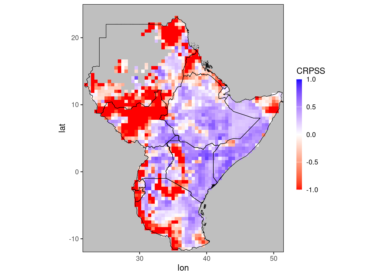
We use the term improper rather vaguely for scores that do not systematically prefer the prediction of the correct distribution, in expectation. The mathematical definition of improper is restricted to scoring rules, which are evaluated on single forecast-observation couples. This is not the case for quite a few scores considered here.↩︎